Here are a few of my artistic/fun-style logos. I have more corporate style logos and those are interesting to create as well, but these logos usually get more interest from the casual viewer.
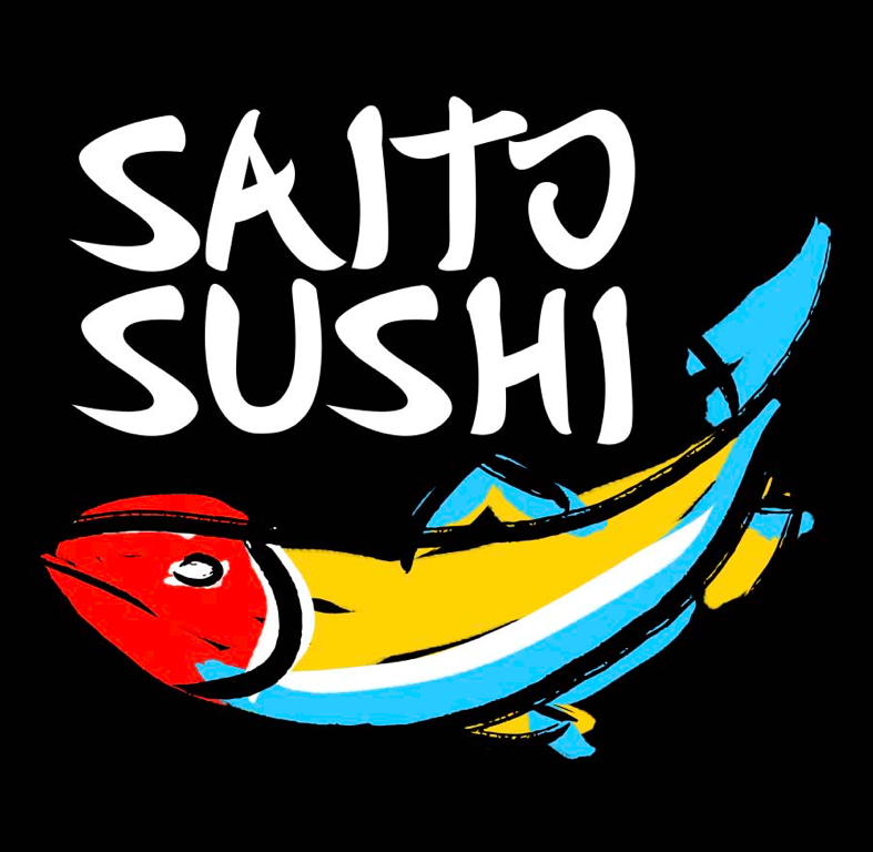
I was contacted to create a logo for new sushi restaurant. The clients wanted something artistic, they wanted it to have a "painterly feel" but wanted it to be a vector graphic. It also needed to look appealing and classic.
I used the primary colors and dropped the painted black brushstroke against a black background because I felt it gave the design a more dramatic look. This logo is used on the outdoor sign, the menu, business cards and staff shirts.
This logo was also a mixture of traditional shapes and fonts, but the colors and tagline (written by me) were aimed at a more modern sensibility. The result is a memorable mixture of current and old school.
Check out the ad campaign and copy I created for them: Wentworth Hat Factory
Check out the ad campaign and copy I created for them: Wentworth Hat Factory
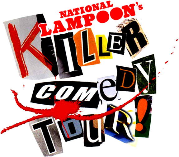
This was created when I was the Art Director for the National Lampoon. This logo appeared on two different touring buses. The buses were filled with comedians for the TV show, "National Lampoon's Killer Comedy Tour."
One bus toured the east half of the United States, the other toured the Western half.
The logo was meant to look like a ransom note.
One bus toured the east half of the United States, the other toured the Western half.
The logo was meant to look like a ransom note.

The offset colors, font and the stylized, smokey "S" all help this design convey the feel and look that the owners of "Vapaahs" were going for.
The early 60's style advertisement illustration and font along with the limited color palette and "aging" of the label and the intentional misregistration of the colors help give this logo/label a fun look that you can't help but feel compelled to pick up and study. And if you get a customer to hold your product in the store, that's half the battle.
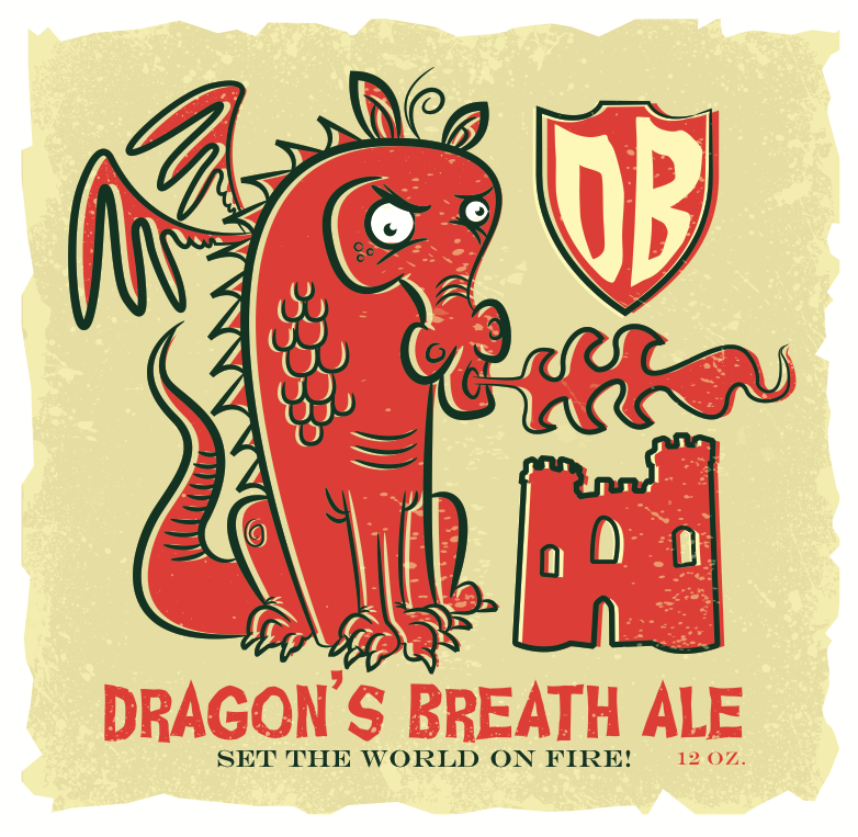
Check out the print ad and tee shirts here: Dragon's Breath Ale Campaign
Check out the print ad and tee shirts here: Dragon's Breath Ale Campaign
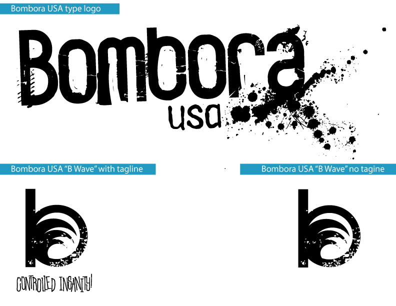
Bombora USA logos and tagline. The object was to make a logo that captured the "high" of surfing. As I was describing the way I envisioned that "high," I blurted out the words "like a controlled insanity." To be honest, as soon as I said it, I knew it was good. Fortunately I didn't have to convince anyone. They loved the phrase and it became the company's motto. Check out the poster graphics I did for this line here: Bombora USA
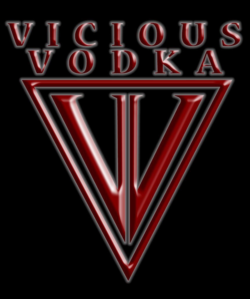
This is a logo I designed back in 2006 for a company that had come out with a caffeinated vodka. This was a very new thing at the time. I Art Directed the look of the bottles and the graphics (shown elsewhere on this site) on those bottles as well. This was done years before the HBO series, "True Blood," and I remember thinking they must have been inspired by the Vicious Vodka.
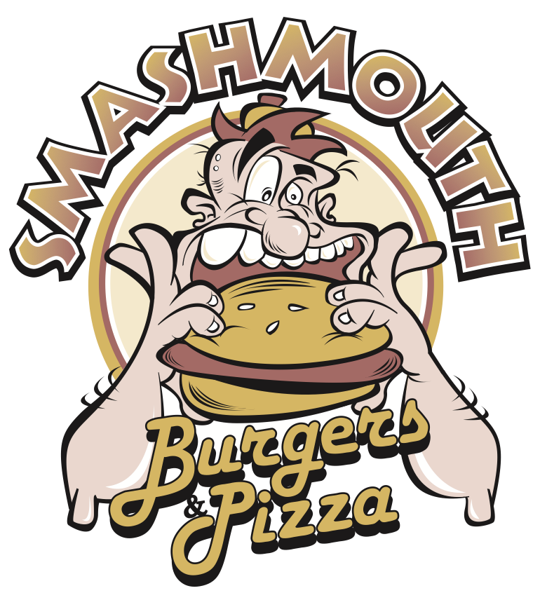
Smashmouth Burgers and Pizza is a chain of Indiana restaurants that have been called a delicious alternative to fast food. Creative menu items, such as a Cuban Sandwich-inspired Cubano Burger and Buona Burger topped with marinara sauce, salami, mozzarella cheese and banana peppers helped turn these eateries into a local hotspots for the past ten years.
The atmosphere is fun and casual, and the owners wanted a logo to reflect that vibe. The idea here was kind of a modern take on the Archies Comics of the 50's. The Smashmouth logo was so successful, they quickly stated selling tee shirts at each establishment.
The atmosphere is fun and casual, and the owners wanted a logo to reflect that vibe. The idea here was kind of a modern take on the Archies Comics of the 50's. The Smashmouth logo was so successful, they quickly stated selling tee shirts at each establishment.
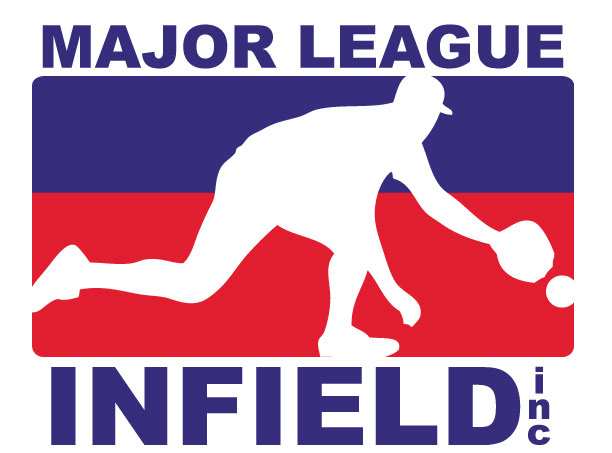
Major League Infield inc. is a subsidiary of Major League Softball. MLI's chief responsibility is field maintence and upkeep on the many baseball and softball fields that Major League Softball runs. The object of this logo was to make it look as if it fit in stylistically with the logos of the MLB, NBA, NHL and the NFL.
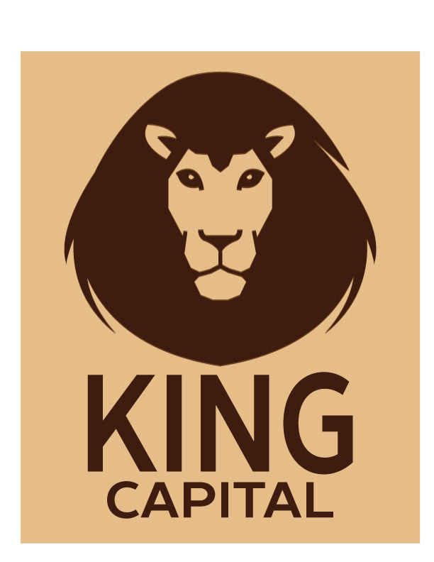
King Capital founder, Bernard King is both a financial expert and a lover of wild animals. His direction for this logo was straight forward. Noting the strength and respect the king of the jungle commands in his natural environment as well as in a graphic sense, King stated, "I want the face of a lion to be the face of my company."