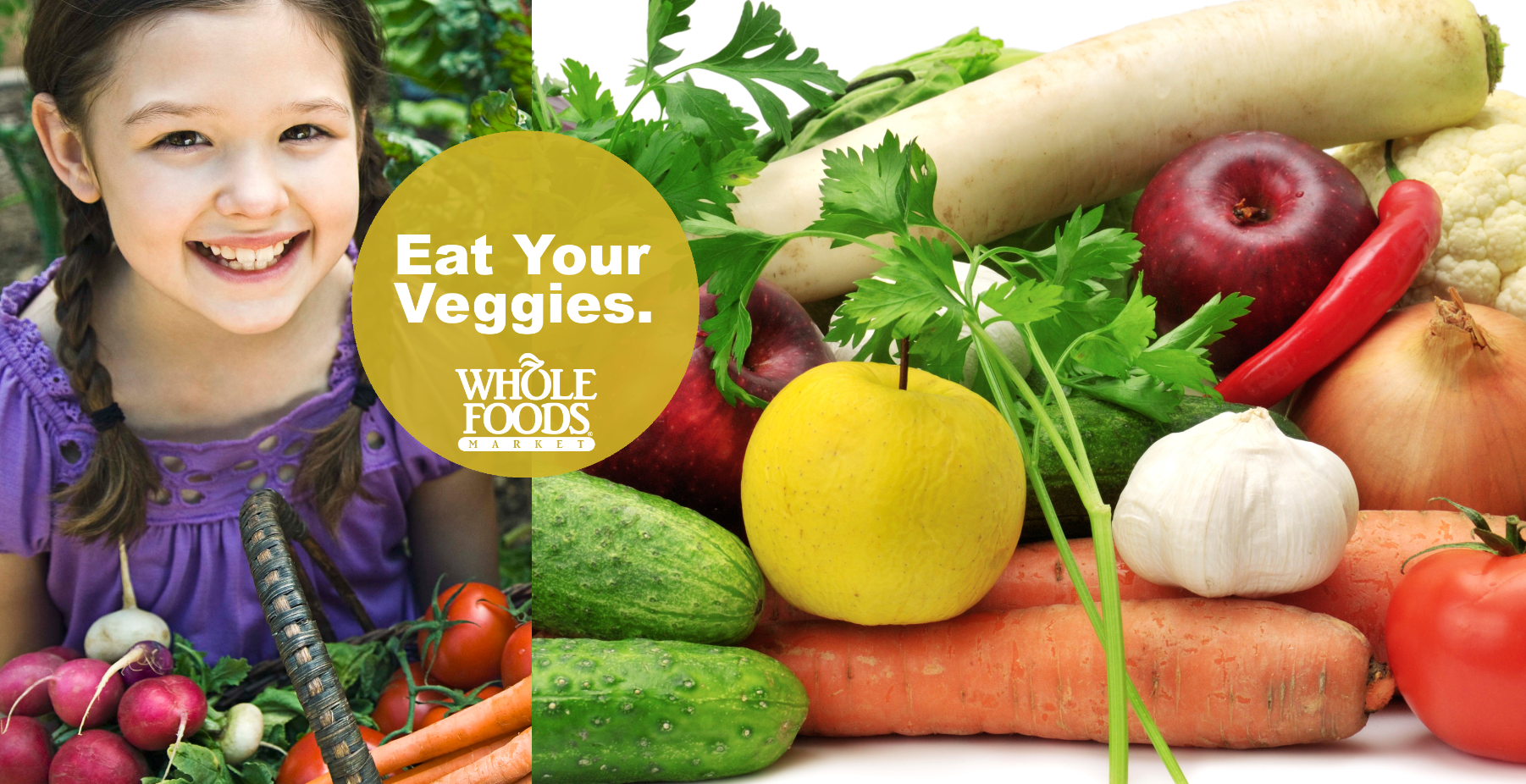
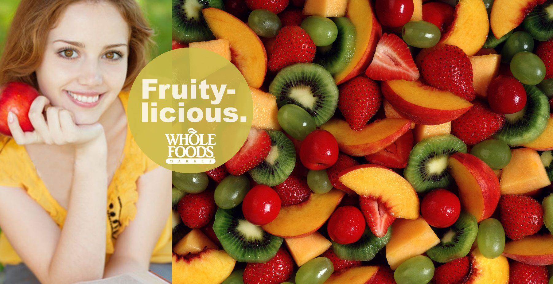
This assignment was straightforward. Show a diverse group of people enjoying various food items, come up with a headline for each, and include the Whole Foods logo. I designed probably a dozen in all.
Color played a big part in these designs. I wanted to make sure the "people" photos and the "food" photos blended harmoniously.
You'll notice I utilized the "Rule of Thirds" principal. The Rule of Thirds is a very effective, yet basic design concept that designers and artists have been using since ancient times. If it ain't broke.....
The banners hung high above the aisles in the stores. In cases like these, you don't want to get too designy. It's much more effective to let the images speak for themselves.
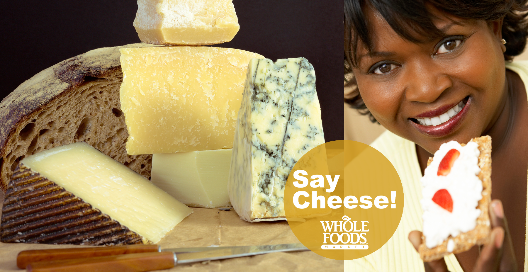