Hinano, Tahiti’s national beer, was born in the heart of the South Pacific in 1955 and has a great deal of history and culture behind it, so it was an honor to be asked to re-think their current beer label, design some vintage looking collage posters, and mock-up some merchandise for this storied company.
BTW, I did have the pleasure of a few six packs during my time on this project and it's a delicious beer.
BTW, I did have the pleasure of a few six packs during my time on this project and it's a delicious beer.
Below are 8 different designs for the re-imagining of the current beer label. These designs will definitely be used on merchandise like tee shirts, bottle openers, refrigerator magnets, but it's possible one of two may find itself on an actual bottle one of these days.
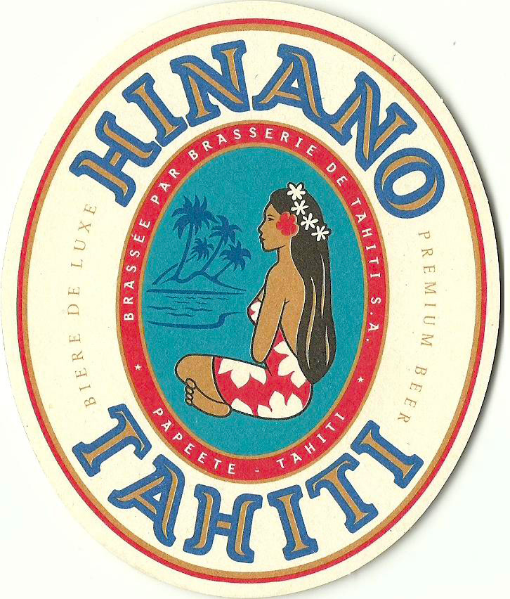
THIS IS ACTUALLY THE CURRENT LABEL.
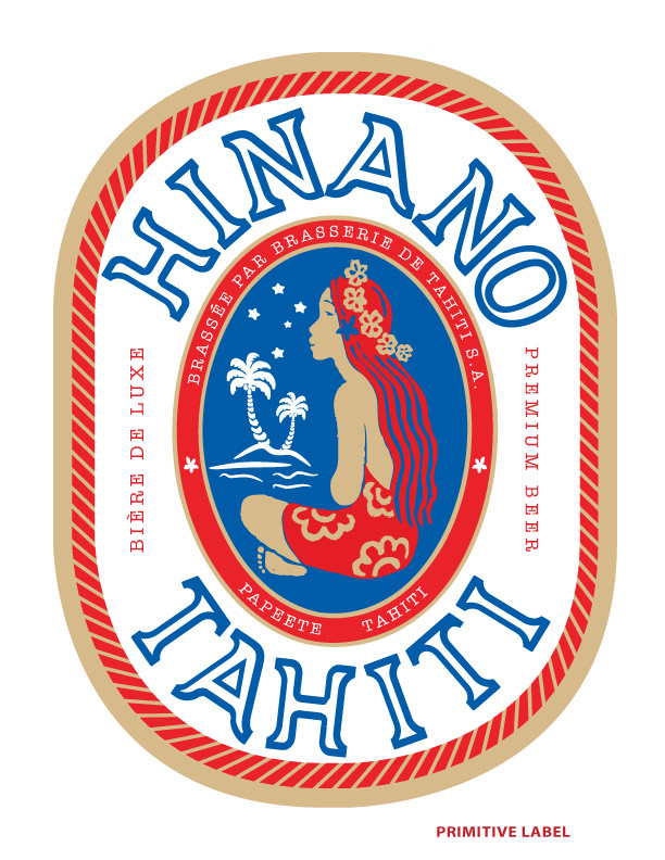
This version is a throwback to their original 1955 label. The "Vahine" (woman seated) is drawn in a more primitive style then today's Vahine.
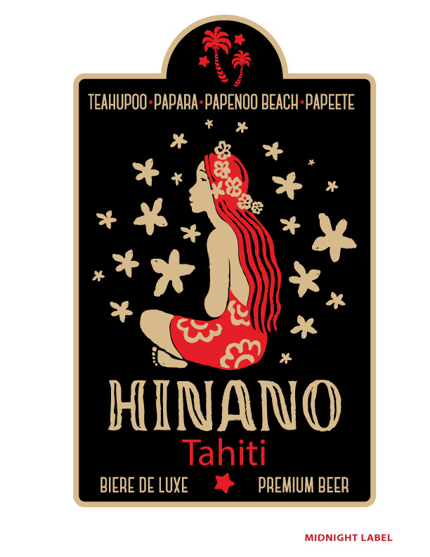
I really liked this one. I felt it felt the most authentic, and while most of the room agreed, in the end they felt uncomfortable leaving the traditional red, white and blue color scheme. To be honest, I expected that, but since I was presenting so many versions, I felt this style needed to be represented. They liked it enough to put it in their tee shirt line.

Here's another example of a design I really liked. This one is simpler than most of the others, and again, while the feel may feel a bit more authentically Tahitian, the concern was it strayed too far from the familiar colors palette. The color combination is powerful.
This version seems like the most modern looking version of the bunch. I like the word "Hinano" breaking out of the oval, and I can definitely see this design as a new label or on a tee shirt.

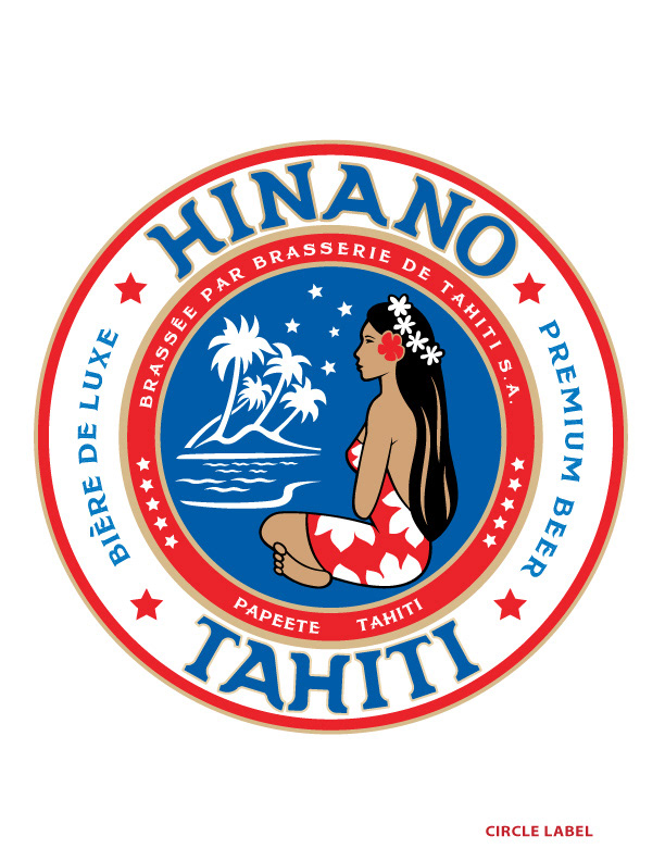
This "Circle Lable" is the closest thing to the current design. The current version is a strong design, so no one wanted to get too far removed. I think this proves a solid option under those ground rules.
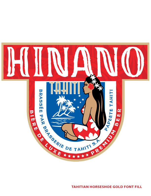
If you're a label peeler like me, you'll enjoy this style. I imagine you'd be able to remove the entire label with no rips or tears almost 100% of the time with this heavy rectangular top.
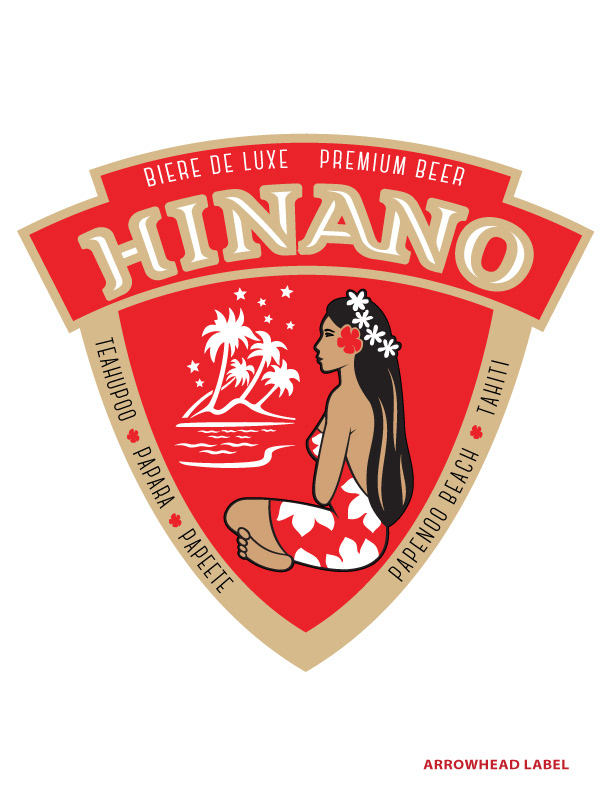
The "arrowhead" label was an interesting shape. I pared down the color palette slightly. I presented this one last, because while I like the design, it doesn't fit in with the rest. It's a good design, but I think the label shape reads more European than Tahitian.
The rectangle version comes in 5 colorways.
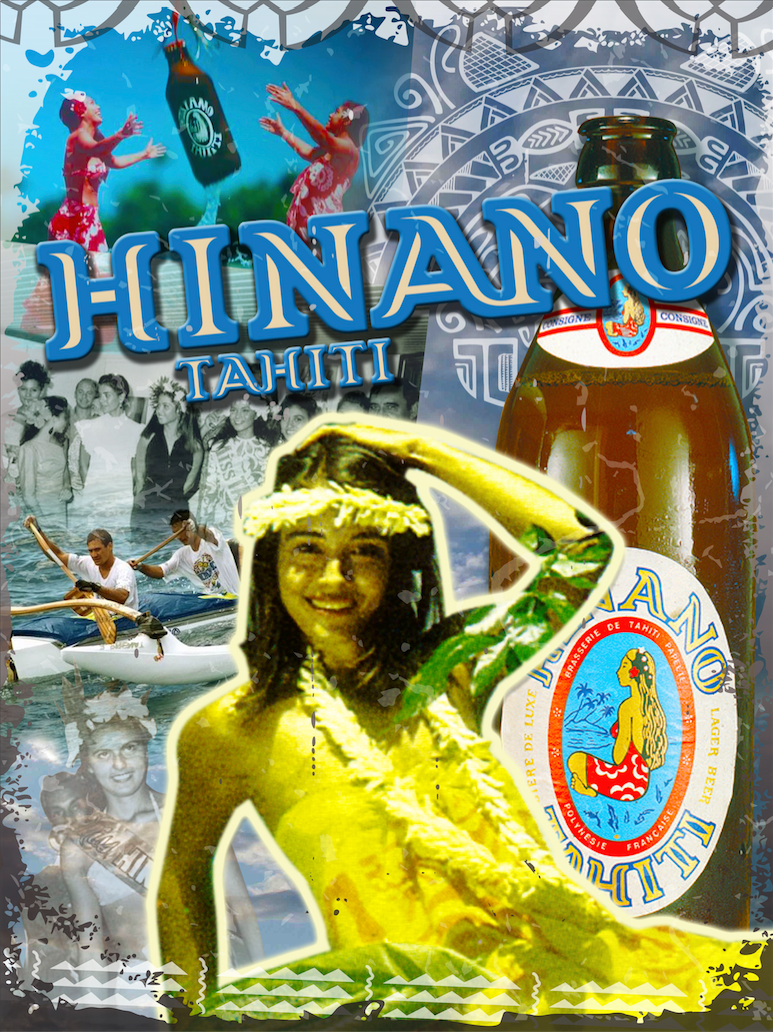
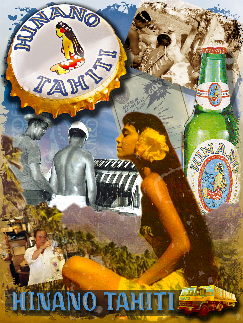
"Vintage" Collages. Printed on Tin, Displayed in Bars.
Collage #1
Collage #2

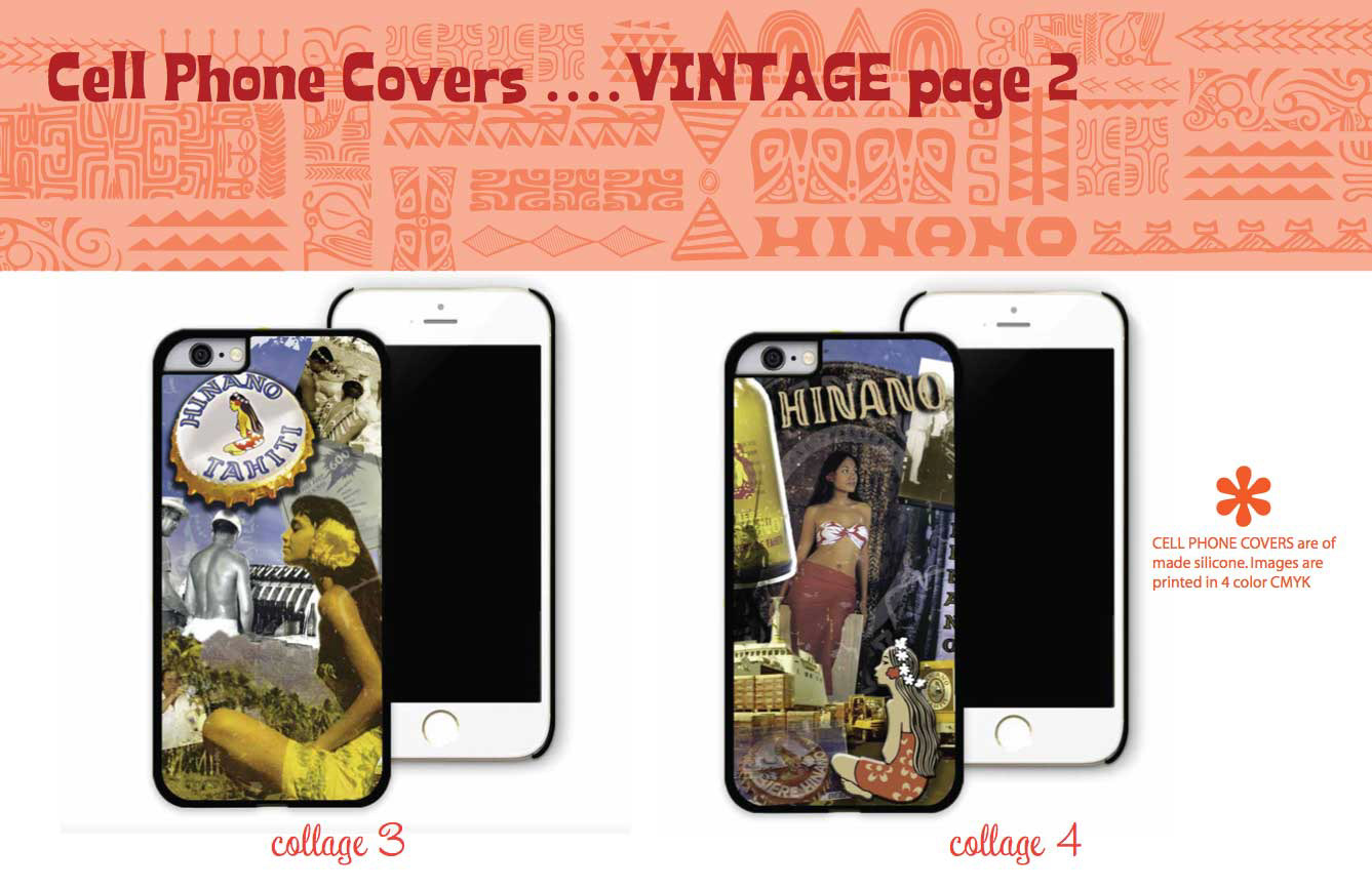
Collage #3

Collage #4
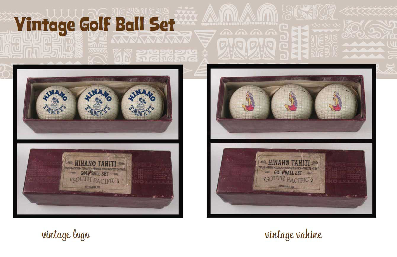
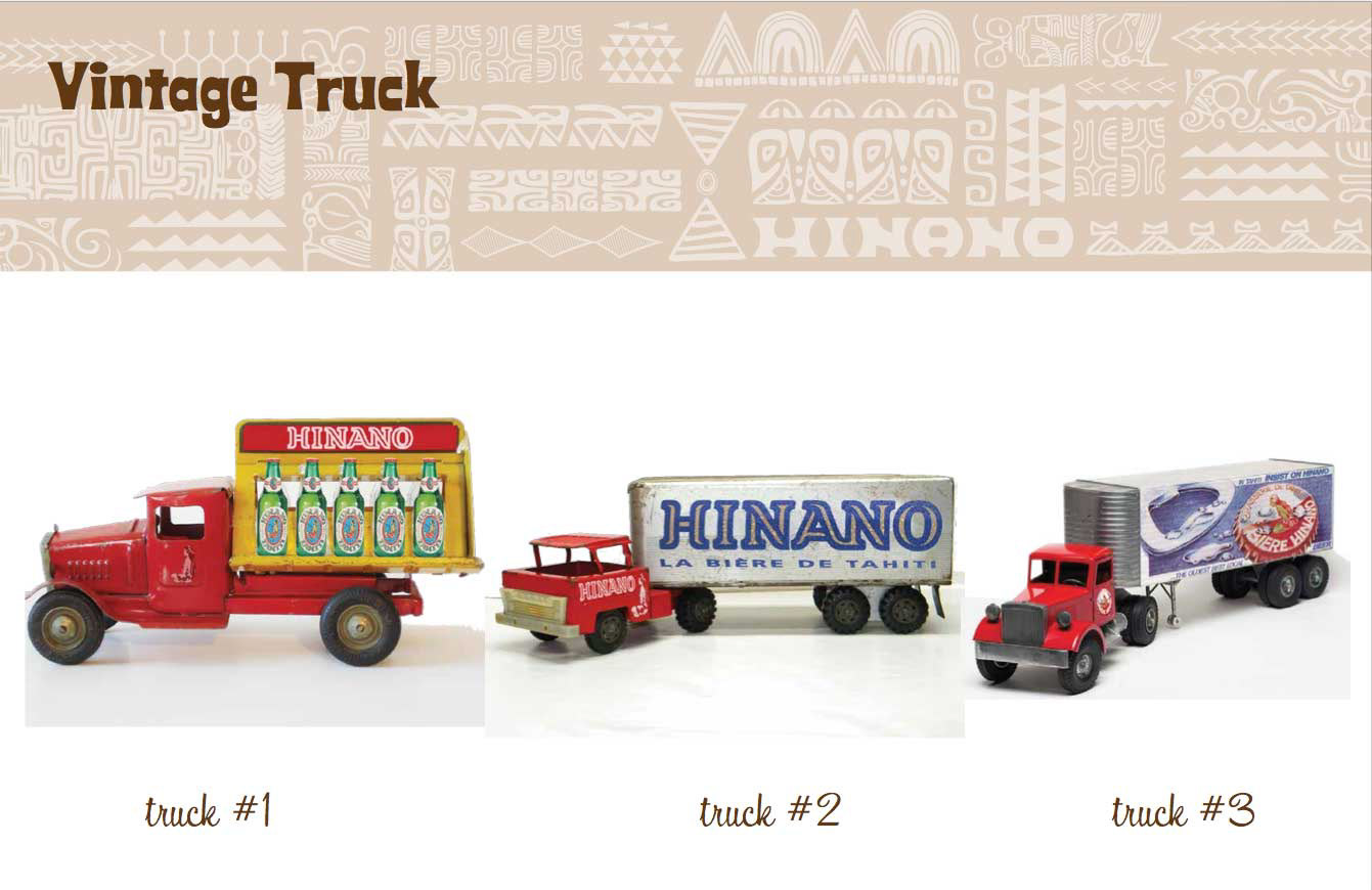
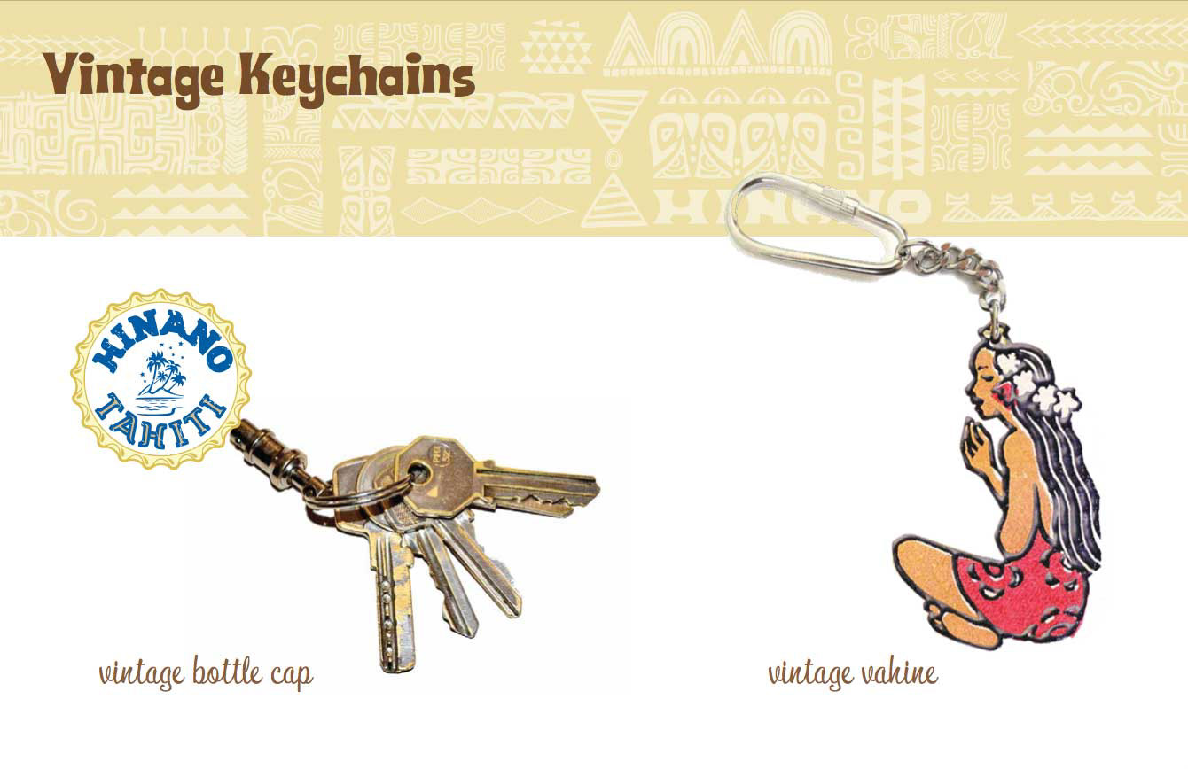
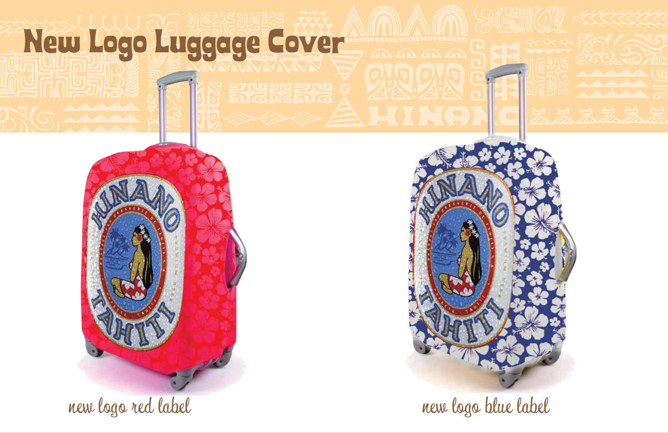
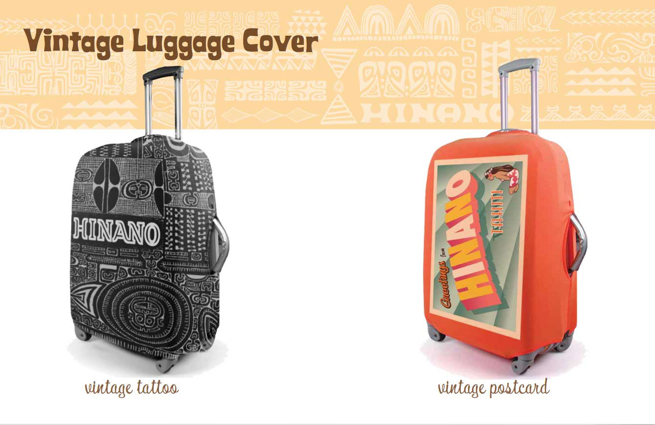
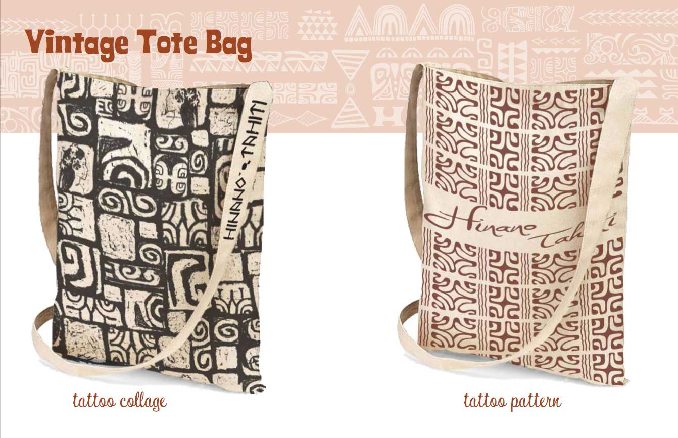
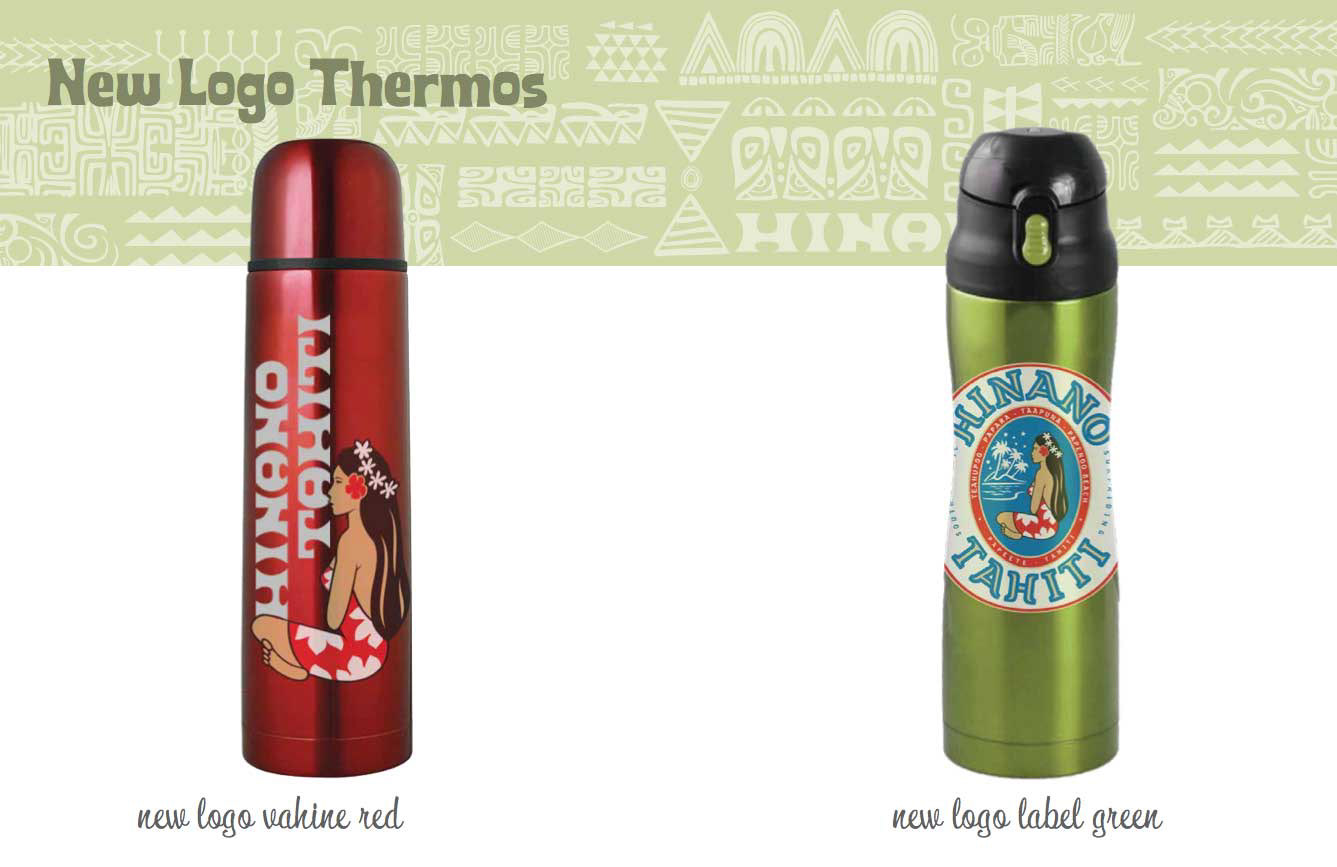
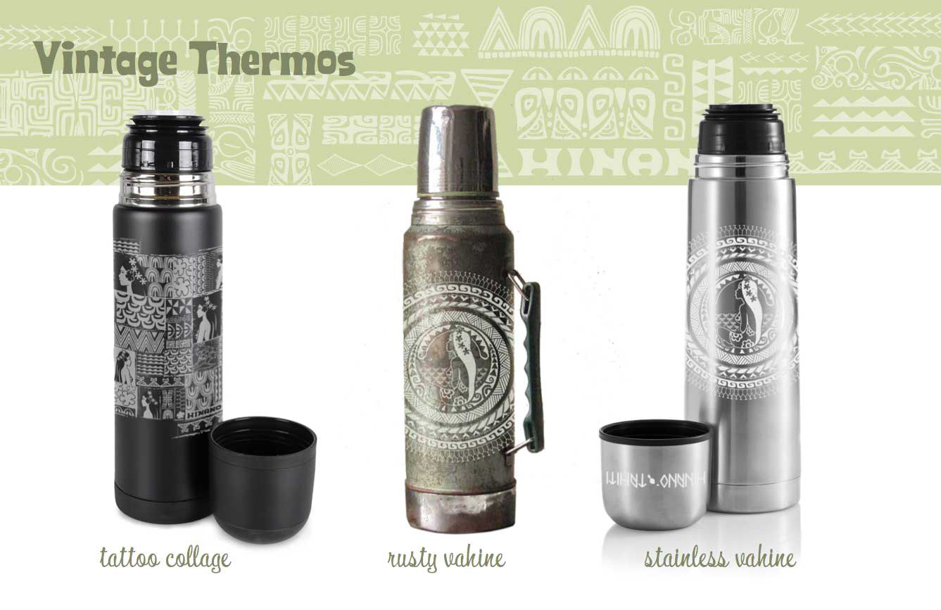
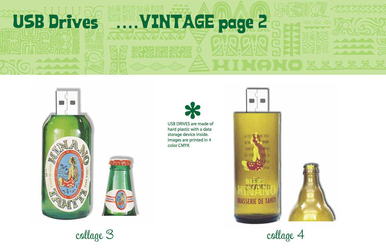
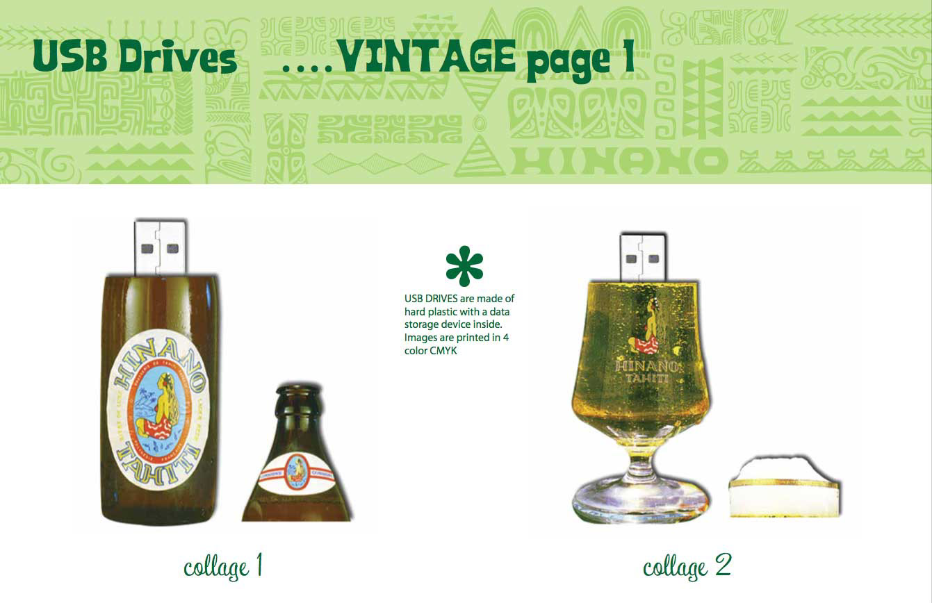
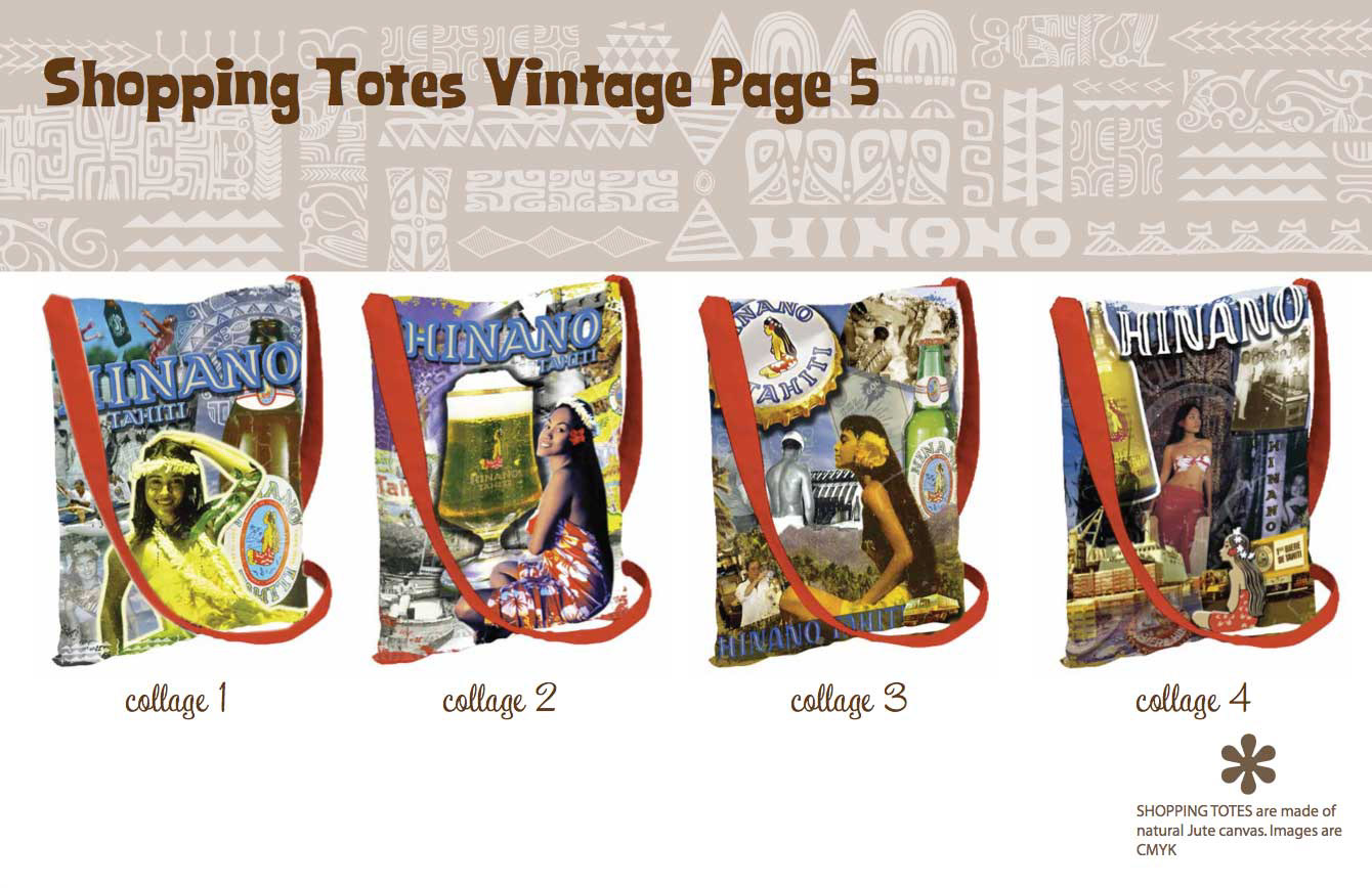
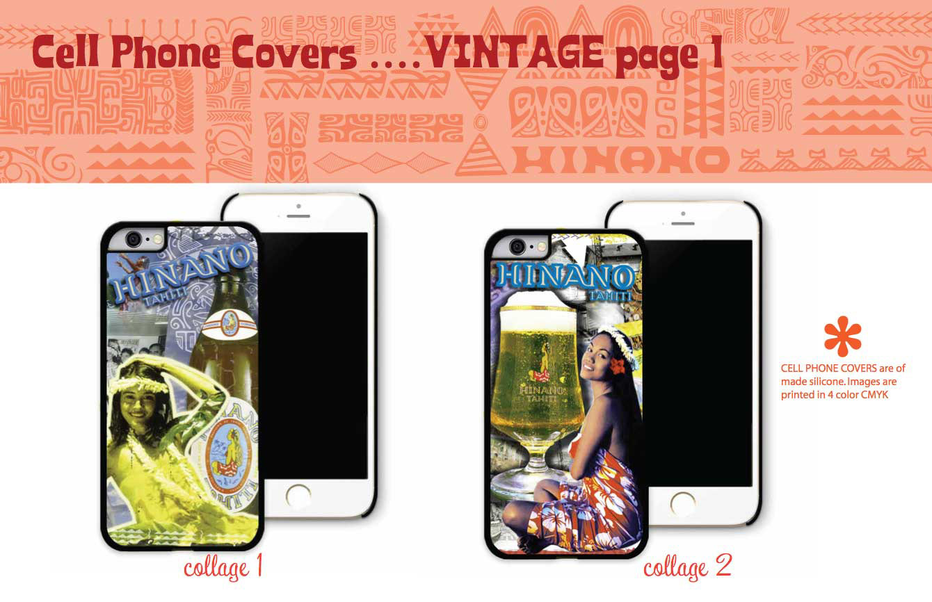
Merch and Swag